Building NoBrokerHood's B2B Advertising Platform - a trust-first acquisition experience that helped position NoBrokerHood as a premium advertising platform for brands targeting gated communities.

Team
Business
Marketing
Design
Engineering
Responsibilities
Product Strategy
UX Research
Information Architecture
UX Writing
Interaction Design
Responsive Design
High Fidelity UI
Developer Handoff
My Role
Sole UX Designer
The Business Context
NoBrokerHood already offered advertising opportunities to brands, but the existing page wasn't communicating its value effectively. Brands were introduced to inventory before understanding why NoBrokerHood should be trusted with their advertising spend, or what results they could expect.
As NoBrokerHood expanded its monetisation efforts beyond its 2.0 platform, the business wanted the page to tell a stronger story - one that could establish credibility and generate higher-quality inbound leads from advertisers.
The Objective
Design a self-serve acquisition experience that could:

Understanding the Existing Experience
Instead of immediately redesigning the page, I first audited the existing experience to understand why it wasn't effectively converting interested brands.


Inventory was introduced before establishing credibility
Generic messaging failed to communicate measurable business value
Important sections lacked visual hierarchy
The page ended abruptly without reinforcing the business proposition.
Understanding Enterprise Buyers
Unlike consumer products, this platform wasn't designed for a single user persona. Different stakeholders visited the page with different goals, ranging from performance marketing to brand awareness and media planning. The experience had to answer the questions every decision-maker asks before investing in a new advertising platform.
Primary Personas

"Will this platform deliver measurable business outcomes?"
Goal:
Drive qualified leads and measurable conversions.
Needs:
ROI-focused messaging
Audience reach and performance metrics
Proof of successful campaigns

"Can I reach exactly the communities that matter?"
Goal:
Increase brand awareness among affluent households.
Needs:
Premium brand perception
Trusted environment
High-quality audience demographics
The Key Insight
During research, one pattern became clear. Enterprise buyers don't evaluate advertising platforms by looking at inventory first. They first need confidence that the platform can deliver business outcomes. This shifted the design challenge from selling advertising spaces to building trust before introducing the product.
Directions on the Table
The obvious starting point - and the one the business initially wanted to pursue was to mirror MYGate, our closest direct competitor, matching their flow, their visual language, and their messaging, and positioning NoBrokerHood as the improved alternative.
What I Did Instead
I pushed back on this. Explicitly positioning the redesign as "better than MYGate" would implicitly tell brands our existing platform had been underperforming - the wrong message to lead with for the trust we were trying to build.
Instead, I grounded the redesign in what the gap analysis had actually surfaced: specific, fixable trust and credibility gaps in our own experience, independent of what any competitor was doing. I took these findings to the VP, Sales & Monetisation, and the trust-first direction was approved and shipped as the platform's new positioning.
Designing the Information Architecture
This insight fundamentally changed how I structured the page. Instead of immediately showcasing advertising inventory, I designed the experience around the sequence in which enterprise buyers build confidence.
Why this sequence?
✓ Establish trust before selling
✓ Answer one decision at a time
✓ Reduce cognitive load
✓ Progress from awareness to conversion
✓ Match how enterprise buyers evaluate vendors

Designing For Trust
The first twenty seconds determine whether a brand continues exploring or leaves. Instead of leading with products, I prioritized credibility through audience quality, platform scale, existing customer trust, and measurable business impact. This helped transform the page from feeling like a catalogue into a premium advertising proposition.

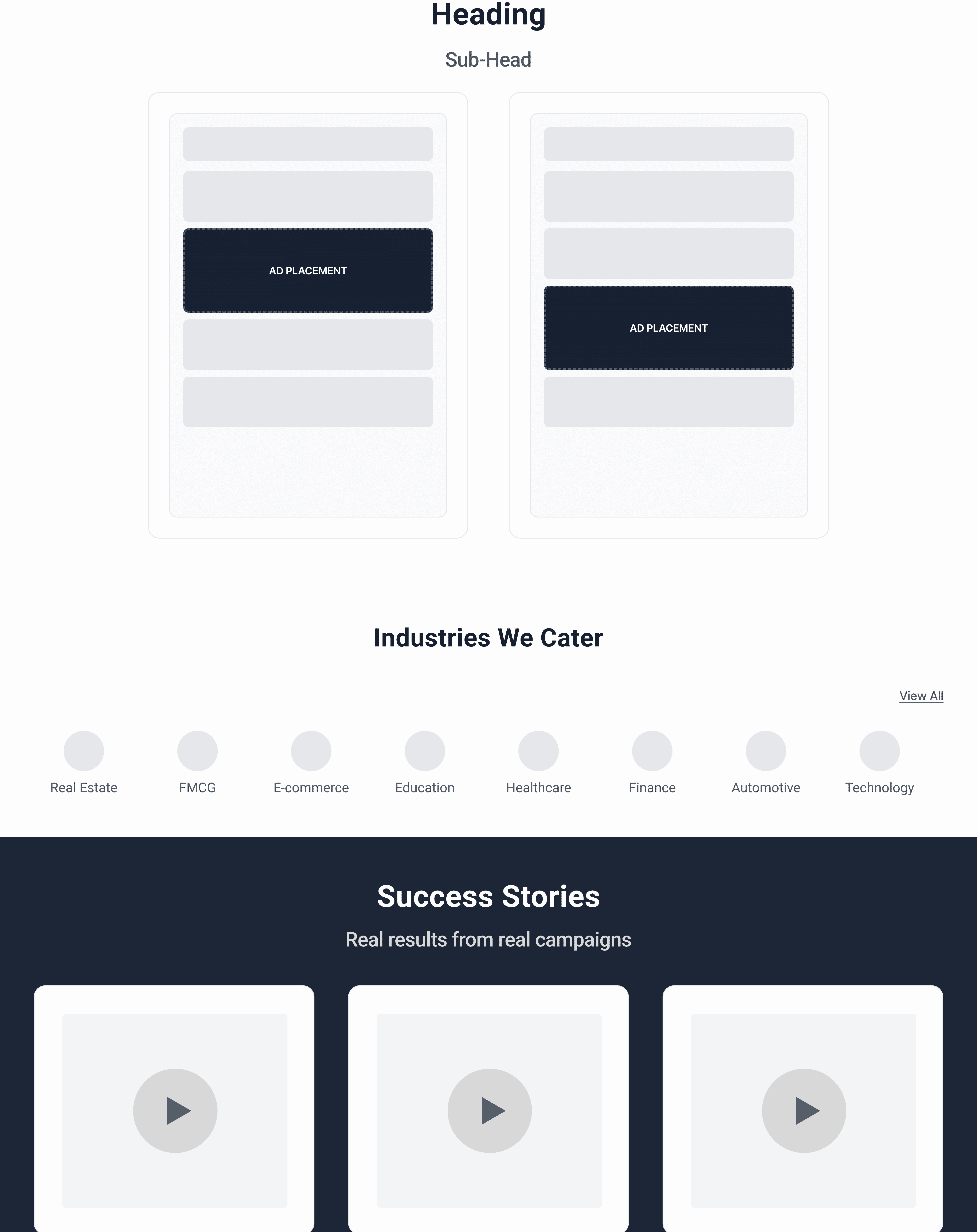

Simplifying Discovery
One of the biggest usability issues in the previous experience was that brands had to mentally connect multiple pieces of information before understanding whether NoBrokerHood was relevant to them.
I restructured the middle of the page to progressively answer three questions:
Where will my ads appear? - App Placements
Is my industry supported? - Industry categories
Has this worked for other brands? - Success stories
By reducing cognitive effort and sequencing information intentionally, the page became easier to navigate while maintaining business focus.
Bringing Everything Together
The final experience guides enterprise buyers through a clear decision-making journey:
This aligned the user journey with both business goals and buyer expectations.
Project Wrap-Up
Outcome and Reflection
The redesigned experience shipped with sign-off from the VP, Sales & Monetisation, and went on to surface 20+ brand partnerships across FMCG, fintech, automobile and lifestyle categories.
Designing a single page for multiple enterprise stakeholders - each evaluating the same platform through a different lens was the hardest part of this project. It taught me that the right design direction isn't always the one that looks most polished; it's the one grounded in what your own research actually shows, even when there's pressure to take a shortcut by copying what's already working for someone else.